Thrivent
UX Copy - Campaign Landing Page
UX Copy - Campaign Landing Page
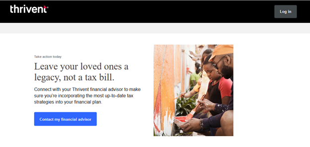
Challenge: The annual wealth transfer campaign typically employed vague themes like "generosity" or "leaving a legacy". Users had to sift through the content to understand the key message - "When you die, your loved ones will have to pay a lot in taxes. We can help you avoid that."
Action: Applying the UX mantra, "Don't make me think", I worked with the internal client to align on using "tax savings" as the key messaging theme because it's clear and instantly understandable. I wove the idea of "leaving a legacy" into the messaging, but always kept tax savings at the heart of the story. Finally, I simplified the informational content and presented it in small, digestible segments that would engage - not overwhelm - the user.
Result: Performance metrics are not available, but the simplicity and directness of the copy and the content design have become the standard for campaign landing pages.
UX Design - Long-form Article Page
Before After
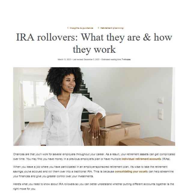
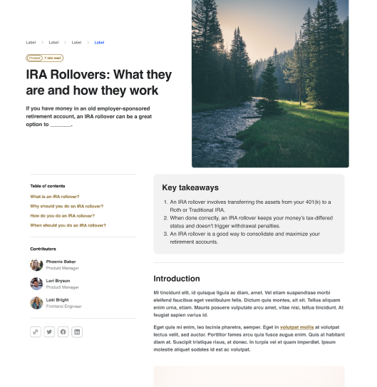
Challenge: Thought leadership articles on the website were lacking in visual hierarchy and structure. They contained valuable information, but it was too hard to find. We needed to build a better reading experience for our audiences.
Action:
- Discovery - I worked with the business partner to identify the goals, challenges, business objectives and performance metrics of the articles.
- Discovery - I researched UX and SEO best practices for long-form article page design and copy.
- Design - I wireframed the article page based on UX best practices for mobile and desktop content hierarchy, visual hierarchy and page design.
- Design/Requirements - I shared the wireframe with a UX designer who created mobile and desktop mockups based on existing components in our design system.
Result: The new design offers a scannable above-the-fold experience that quickly gives the user an overview of what to expect. Offering a templated layout with a clear title and subhead, a brief and meaningful introduction, a table of contents with jumplinks to specific sections, key takeaways, and the author and publishing date will create consistency and familiarity, build credibility, and enhance the brand experience.
Xcel Energy
UX/UI Copy - Dashboard Experience
Challenge: Creating an integrated, seamless post-login experience was the top priority of the Xcel Energy Experience Transformation team. Prior to this work, the experience was disjointed and inconsistent, resulting in low customer engagement and satisfaction.
Action: I wrote and edited the UX and UI copy using simple, readable language and consistent terminology, and consulted regularly with the UX designers to ensure consistency in design, scannability, usability and egagement.
Result: My team's version of the My Account experience has been in use for over two years.
UX/UI Copy & Design - Enrollment Flow Alignment
Challenge: The Xcel Energy Experience Transformation team established four separate product teams to create enrollment flows for four different services and products. I was the UX writer on all four teams - yes, all at the same time - and began to notice inconsistencies in language and design across the experiences. I took it upon myself to align the design and copy of all four products to ensure consistency in language and design flow across the products, which would create familiarity, lower cognitive load, and enhance brand and user experiences.
Action: I audited the flows side by side and identified inconsistencies in layout, flow sequencing, terminology and punctuation. I illustrated the discrepancies and presented them to the product teams. We worked together to align on screen designs and language, and codified them into templates to be used for future enrollment flow work.
Result: Enrollment flows now follow the sequence and use the same terminology established by this work, so users will be familiar and comfortable with the enrollment process, no matter the product.
|
UX Leadership - Design System Content Guidelines
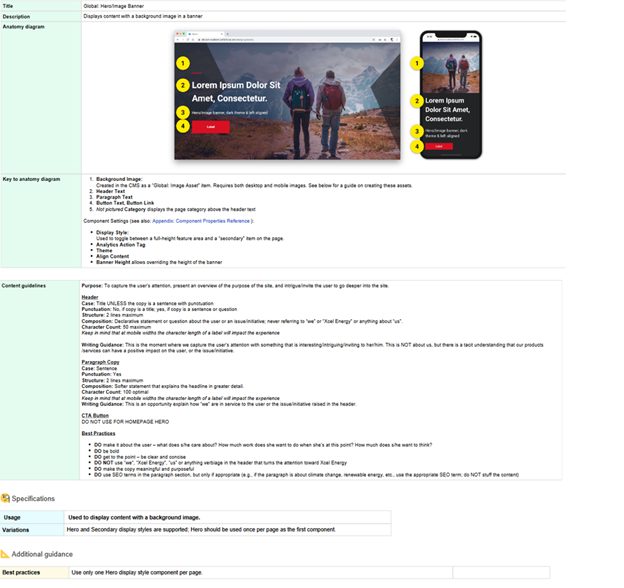
Challenge: With a number of siloed product teams and a separate website content management team, it was imperative to create a design system that ensured consistent user and brand experiences across all segments of the user journey.
Action: I teamed with a Senior UX Designer to use InVision to create a design system that would provide design and copy guidelines for every design component, atom and molecule in the system. We enlisted two other UX team members to create a design system governance product team which maintained and updated the system, and reviewed and approved new design submissions from other product teams. Result: The copy guidelines in the design provide direction for case, punctuation, structure, composition, character counts and other UX and writing best practices to ensure consistent experiences across all content. |
|
UX Copy - Product Detail Page
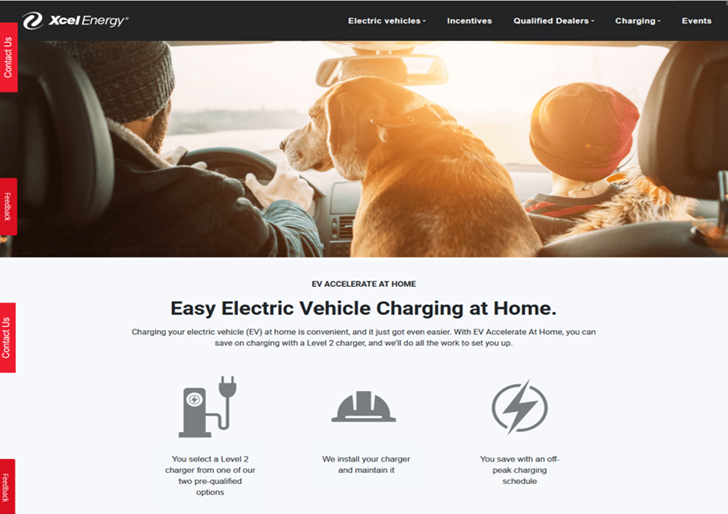
Challenge: EV charging has consistently been a source of confusion and anxiety for the EV prospect audience, so Xcel Energy partnered with an outside platform to help make selecting an EV and installing an EV charger as easy and seamless as possible.
Action: I worked with the internal EV team to simplify the content and present it in meaningful, accessible chunks. I used SEO terms and a conversational tone to make the page findable and readable. I used visual devices to illustrate steps in the process and bullet points to quickly establish elegibility for the program. We created a table to illustrate pricing and used cards to highlight the two types of EV chargers users chould choose from. We used numbered content to reiterate the steps presented at the top of the page and build familiarity with the process. We finished the page with a series of FAQs to address any outstanding questions users might have, and introduce issues they may not have considered.
Result: Performance data is not available, but this page has existed in its current state for over two years and serves as a one-stop source for EV charging information.
UnitedHealthcare/Periscope
UX Copy & Design - Brand Awareness Newsletter
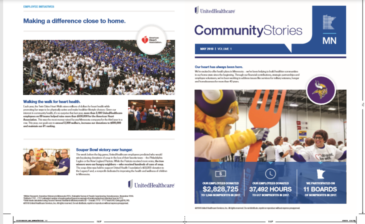
Challenge: As a freelance writer with Periscope advertising agency, I was tasked with creating the second issue of the Community Stories digital and print newsletter for Periscope's client - UnitedHealthcare. The first issue had been pulled together quickly, so the design and layout needed to be reworked. The goals of the second edition project were to showcase UHC community outreach efforts, build the company's philanthropic brand, and create a template for future editions of the newsletter.
Action: The client provided me with a variety of short clips about UHC's philanthropic events. I grouped them into categories, and blocked each category onto a page. I titled each page to signal a specific theme and create a cohesive, meaningful flow for the audience. I wrote each story, incorporating the UHC brand voice and mission into all content. And I collaborated with the designer to identify opportunities to showcase UHC community outreach outcomes with infographics and other visual devices to impart information quickly.
Result: The newsletter was delivered on time and on budget, and its format now serves as the template for subsequent issues.
Voya
UX Copy & Design - B2B2C Email/Direct Mail Campaign
|
|
|
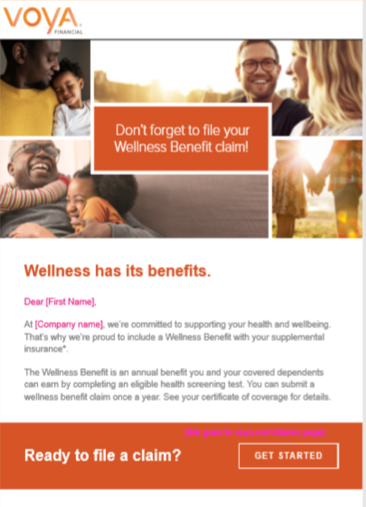
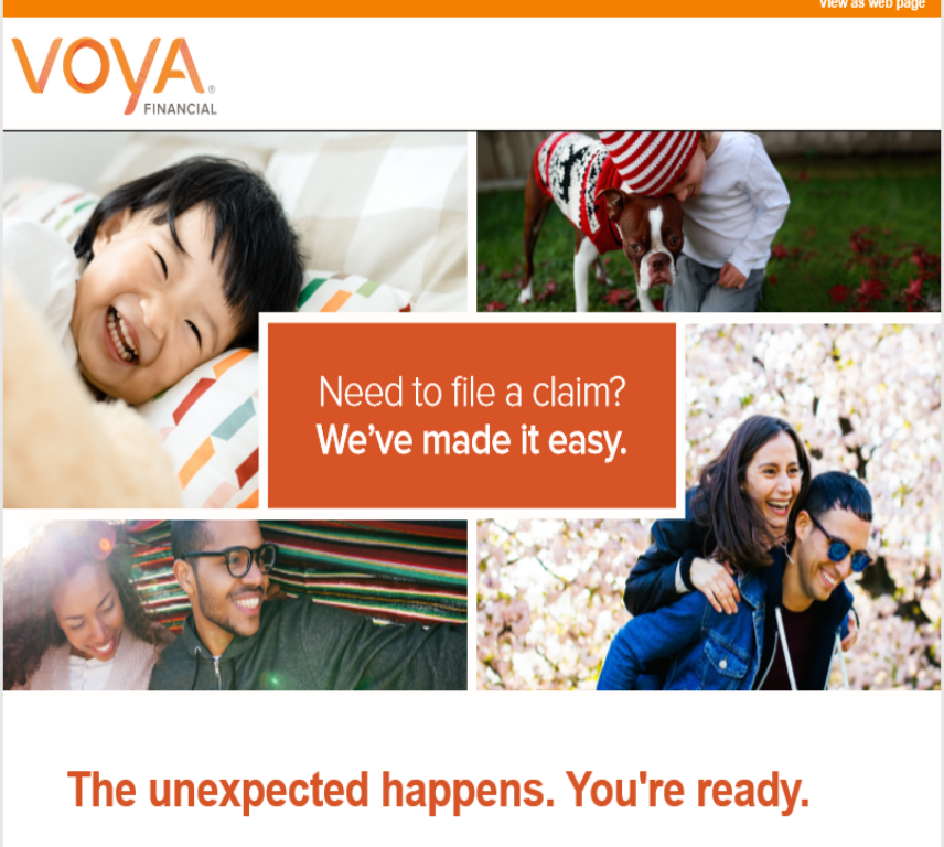
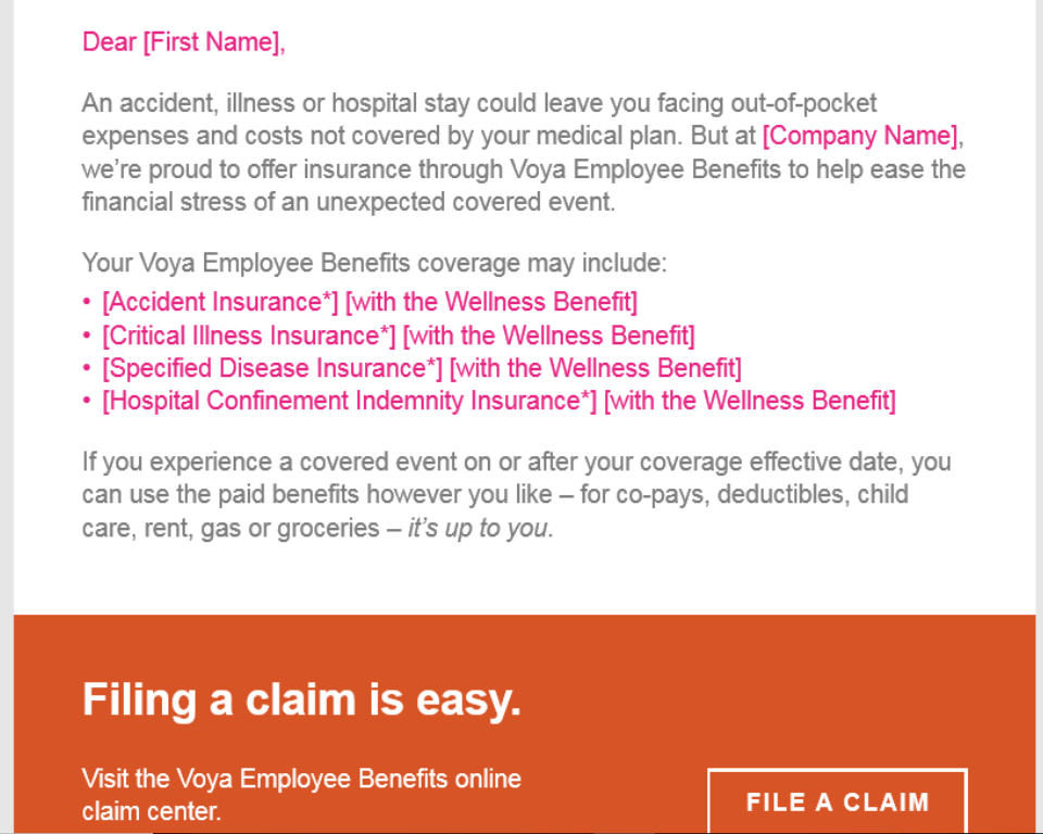
Challenge: Prior to this campaign, Voya's B2B2C content about employee benefit claims was too long, too hard to understand, visually unappealing, and underperforming. The goals of this project were to:
Action: I stripped the existing content of all unnecessary copy and rewrote each message to be singular, simple, and straightforward. This gave each piece more white space and branding opportunities with images, taglines, and calls to action. Each piece was personalized with the recipient's name, their employer's name, and type of coverage they had. And each piece contained one easy-to-understand, actionable message. Deliverables included emails and postcards.
Result: Data is not available to the public; however, this project resulted in a series of personalized, easy-to-understand and actionable communications to guide employees through the claim-filing process. The design and content have become the prototype for future employee benefits communications projects.
- Improve the user experience
- Drive member awareness and engagement in claim-filing process
- Increase the number of employee benefits claims filed
Action: I stripped the existing content of all unnecessary copy and rewrote each message to be singular, simple, and straightforward. This gave each piece more white space and branding opportunities with images, taglines, and calls to action. Each piece was personalized with the recipient's name, their employer's name, and type of coverage they had. And each piece contained one easy-to-understand, actionable message. Deliverables included emails and postcards.
Result: Data is not available to the public; however, this project resulted in a series of personalized, easy-to-understand and actionable communications to guide employees through the claim-filing process. The design and content have become the prototype for future employee benefits communications projects.
Capella University
UX Copy & Design - Product Detail Webpage
UX Copy & Design - Product Detail Webpage
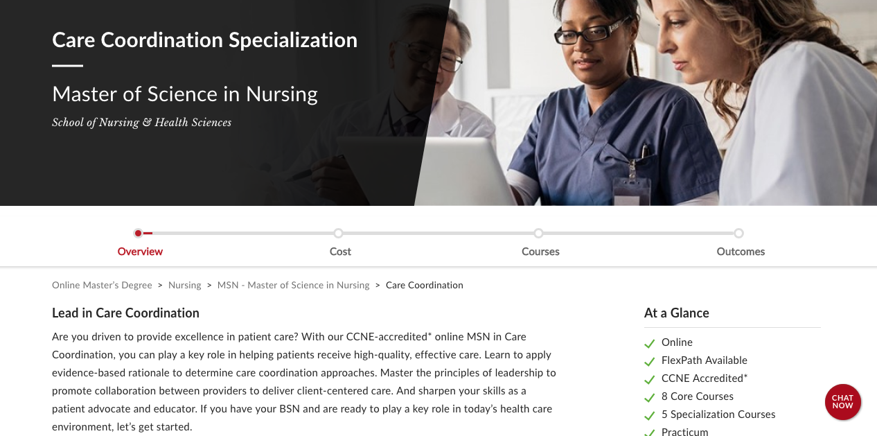
Challenge: Leverage data to enhance user experience and improve lagging webpage performance.
Action: As lead writer of an agile-based cross-functional team, I led the development of the design, layout, and content of key Capella webpages. I partnered with the UX team to guide the design and development teams through in-depth examinations of heatmaps, SEO data, and other performance indicators that identified problematic moments on the pages. From there, I led a series of collaborative design sessions to explore and incorporate SEO and design elements to create a smoother, more facilitative user experience. The sessions resulted in a variety of UX solutions:
Result: Page performance increased substantially (data not available to the public), and the redesigned pages became the template for over 1,300 pages on the Capella University website.
Action: As lead writer of an agile-based cross-functional team, I led the development of the design, layout, and content of key Capella webpages. I partnered with the UX team to guide the design and development teams through in-depth examinations of heatmaps, SEO data, and other performance indicators that identified problematic moments on the pages. From there, I led a series of collaborative design sessions to explore and incorporate SEO and design elements to create a smoother, more facilitative user experience. The sessions resulted in a variety of UX solutions:
- Eliminate the unnecessary
- Increase white space; decrease clutter
- Increase visual interest with infographics and images
- Make it easy to read, engaging, educational, and empowering
- Create a more interactive user experience by embedding more links to other appropriate areas of the site
Result: Page performance increased substantially (data not available to the public), and the redesigned pages became the template for over 1,300 pages on the Capella University website.
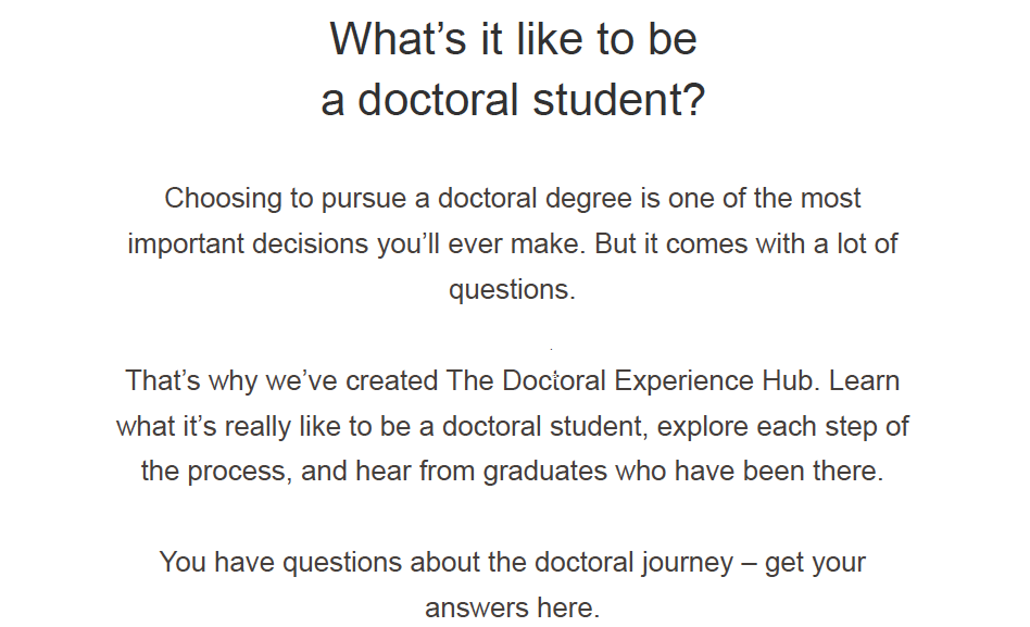
UX Copy - Thought Leadership Content
Challenge: The writing for this project had been outsourced, and was not under my supervision during production. The first time I saw the content was when I was asked to edit it - one day before it was to go live. It was immediately evident that the content was not empathic to the audience, nor was it written to Capella University writing or brand standards. If published, it would damage the university's reputation and credibility.
Action: At 11:00PM that night, I contacted the VP of Marketing and recommended that production be halted on the project so revisions could be made. I fiercely advocated for the doctoral audience, arguing that they needed thought leadership content that was empathetic, educational, and empowering. I stressed the importance of the user experience in thought leadership content. And I provided clear examples of errors in the copy. The VP agreed that publication should be delayed, and I cleared my calendar. I spent the next five days rewriting and elevating the content.
Result: My rewrite offered the doctoral audience an informative, inspirational user experience. By focusing first on the audience, and then infusing the Capella quality and brand standards into the copy, I established the tone for thought leadership content throughout the website.
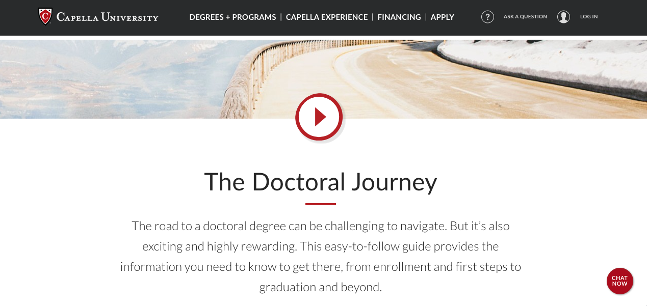
Copy - Email Campaign

Challenge: Create emails to introduce and drive prospective doctoral students to a newly launched thought leadership webpage.
Action: I leaned into UX writing best practices and the empathetic quality of the Capella brand voice to create straightforward, inspirational, actionable content and compelling subject lines.
Result: The new subject lines boosted the email open rates by 7% in one month (data for clickthrough rates not available to the public).
Blue Cross Blue Shield
Copy & Design - Member Engagement Calendar
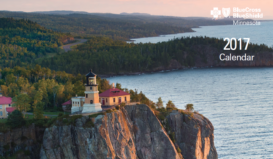
Challenge: Create an engaging, easy-to-read calendar that prompts two Medicare populations to engage in healthful behaviors. Calendar must have a theme that appeals to the audience.
Action: Recognizing this demographic's civic pride and penchant for nostalgia, I created a "Minnesota Through the Years" concept, featuring quotes from famous Minnesotans and important events in the state's history. I included season-specific nutritional and safety tips, ideas for exercise, and reminders for medical appointments. Additionally, I created a timeline for the back cover that featured special dates in Minnesota history.
Result: The calendar was produced and distributed on time and on budget; all stakeholders were satisfied with the finished product.
Copy - Member Engagement Flyers
|
|
|
Challenge: Create content to drive healthful behaviors in two Medicare populations.
Action: I researched the Medicare populations' demographics; then researched the complex medical topics that would be addressed in the flyers. I distilled the topics into accessible, actionable, on-brand content.
Result: The flyers contributed to 4.5- and 5-star Medicare Stars Center of Excellence ratings (out of 5).
Blue Zones/Blue Zones Project
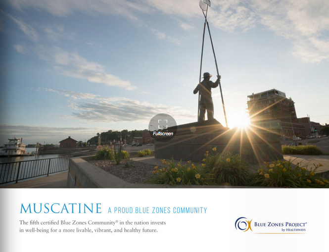
Copy & Design - Whitepaper
Challenge: Presented as a simple editing project, this job expanded after I found the existing worksite assessment - a true white paper- to be disorganized, off-brand, overwritten and off-putting.
Action: I chunked the content into smaller portions, organized it into a meaningful sequence, and rewrote the copy with more lively language that incorporated brand voice and tone. Additionally, I made recommendations for incorporating brand colors and fonts into the headers, subheads, sidebars and text boxes, and placing on-brand images throughout the document to create interest and break up the text.
Result: The document became a dual-purpose corporate wellness tool - 1) an on-brand wellness roadmap for existing clients, and 2) an on-brand marketing asset to present to prospective clients.
Copy - Blue Zones Project Digital Success Stories
Challenge: Tell the stories of three Iowa cities that modified their surroundings and behaviors to become healthier communities.
Action: I interviewed city officials, architects, engineers, and school and government officials to learn how they became involved with Blue Zones Project, and how they incorporated the Blue Zones tenets into their communal ethos. I researched studies on healthful behaviors, and the effects of infrastructure on well-being. Then I distilled my findings into easy-to-understand, inspirational stories.
Result: The content was used in a variety of media, including sales materials, and digital and print collateral.
Copy - Blue Zones Audience Engagement Blog
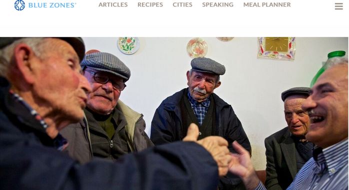
Challenge: Create content that supports Blue Zones tenets, incorporates brand voice and tone, and educates and inspires readers to delve further into healthful living.
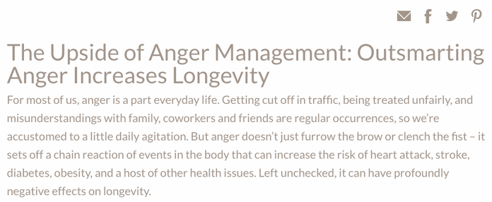
Action: There were no limits on the blog posts - I could choose the subject matter for each one. I realized that I hadn't seen much literature about the effects of anger on health so I began researching it. I found a wealth of studies about the negative effects of anger, and balanced them with research about how to manage anger when it arises. I distilled my findings into a conversational, easy-to-access piece.
Result: This post was one of the most-read posts on the Blue Zones website for months after publishing.
Welcyon, Fitness After 50
Copy - Member Engagement Blog
Challenge: The Welcyon website was lacking in content that served its members and drove business objectives. We needed to create thought leadership content to build brand awareness, drive enrollment and member engagement, and add value for members and prospects.
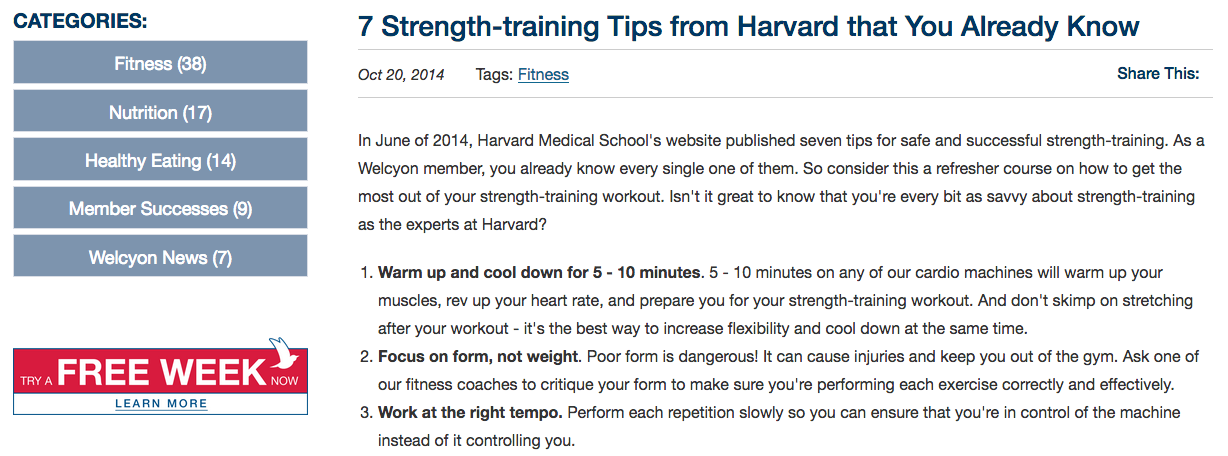
Action: Blog 1 - Because strength training was one of the four pillars of the Welcyon fitness program, I chose to feature it as the website's first blog post. This population was intimidated by weightlifting, so I wrote the blog in an empowering voice, emphasizing that members and prospects already knew what Harvard Medical School was professing.
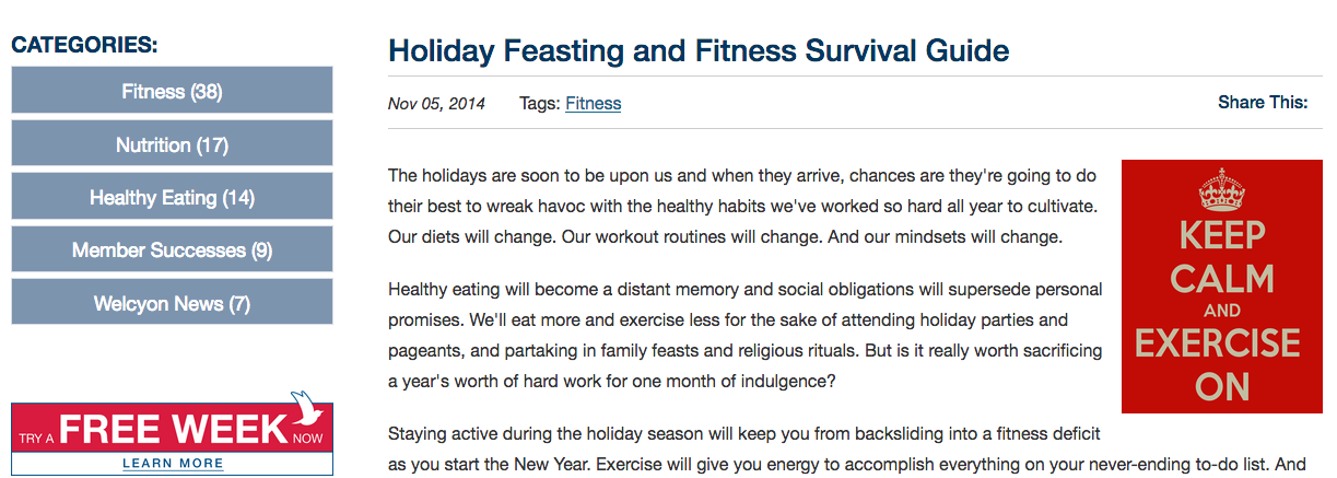
Blog 2 - Holiday eating is an evergreen subject, so the challenge was to write about it in an appealing, engaging way. I used five bullet-pointed phrases that could stand alone and convey the message when scanned; then I supported each bullet point with easy-to-read, informative and inspirational copy.
Result: These posts and others I wrote served as templates for thought leadership blog posts going forward.
Action: Blog 1 - Because strength training was one of the four pillars of the Welcyon fitness program, I chose to feature it as the website's first blog post. This population was intimidated by weightlifting, so I wrote the blog in an empowering voice, emphasizing that members and prospects already knew what Harvard Medical School was professing.
Blog 2 - Holiday eating is an evergreen subject, so the challenge was to write about it in an appealing, engaging way. I used five bullet-pointed phrases that could stand alone and convey the message when scanned; then I supported each bullet point with easy-to-read, informative and inspirational copy.
Result: These posts and others I wrote served as templates for thought leadership blog posts going forward.